
The blockchain can show you that something happened, but it won’t tell you why or who was behind it, or whether it’s actually real demand. A sudden spike in addresses could mean genuine users are piling in. Or it could just be Sybil farmers playing the system. An uptick in TVL could signal fresh capital coming in, or it might just be the same collateral getting wrapped, restaked, bridged, and counted multiple times. A surge in transactions could point to real utility or it could be a bot, a points campaign, an arbitrage loop, or a contract design that forces users to jump through ten steps just to do what another chain handles in one.
At ChangeNOW, we look at blockchain data every day, but we don’t treat it as a scoreboard because we know that on-chain metrics are often mechanically accurate but analytically misleading.
Below are five on-chain metrics that often mislead the market and a better way to read each one.
- The Most Quoted Metric in Crypto, and One of the Easiest to Misread: Active Addresses
In traditional product analytics, you usually have a user tied to an account, a device, an email, a subscription, some kind of persistent identity. On-chain, though, an address is just a public key. One person can easily control dozens of wallets. One wallet can represent multiple people. A smart contract can generate activity that looks user-like. And a centralized exchange can funnel funds for thousands of customers through just a handful of addresses.
Even the definition of an “active address” is broader than most people realize. Coin Metrics, for instance, counts any unique address that’s either sending or receiving ledger changes, and that includes mining, staking, regular transactions, account creation, and other chain-specific events. On some networks, the accounting structure makes things even messier.
In its 2024 State of Crypto report, a16z noted that monthly active crypto addresses hit 220 million in September 2024 but they also made a point of warning that active addresses are much easier to game than other metrics. In a later estimate, they put the real number of monthly transacting crypto users somewhere between 30 and 60 million, which is only about 14% to 27% of that 220 million headline figure.
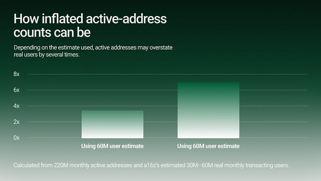
Caption: Active addresses are a useful signal, but they are not the same thing as users. One human can control many wallets; one wallet can represent many people; and bots or Sybil farmers can inflate the count.
A better metric isn’t raw active addresses, it’s quality-adjusted active users. That means addresses or clusters that show repeated, economically meaningful behavior over time.
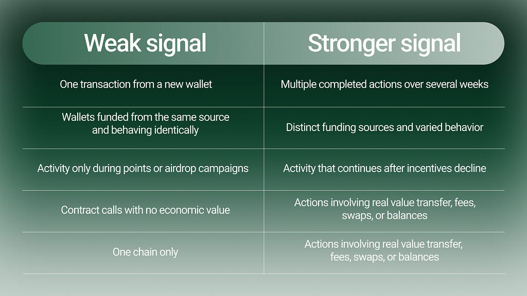
2. The Metric That Confuses Size With Health: TVL
TVL is one of DeFi’s favorite metrics because it’s simple. It takes a whole complicated system and compresses it into one headline number — how much value is locked up. The thing is, TVL can include idle capital, mercenary liquidity, incentive-seeking deposits, recursive collateral, wrapped assets, liquid staking tokens, liquid restaking tokens, bridged assets, and assets whose real exit liquidity is much thinner.
Academic work has become increasingly critical of TVL as a standalone metric. A 2024 paper, Piercing the Veil of TVL: DeFi Reappraised, argues that TVL can be inflated through double-counting activities such as wrapping and leveraging. The authors propose “Total Value Redeemable” as a more reliable alternative and estimate that at DeFi’s 2021 peak, the gap between TVL and redeemable value reached $139.87 billion, with a TVL-to-TVR ratio of roughly 2.
A separate 2025 study on TVL verifiability found that TVL computation is often not standardized and may rely on self-reported or non-transparent methods. In a case study of 400 protocols, the authors’ verifiable TVL estimates aligned with published figures for only 46.5% of protocols. So TVL can be real and still not mean what people think it means.
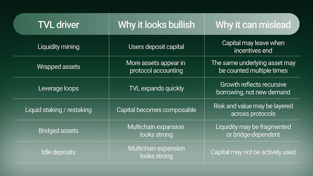
3. Activity Is Not the Same as Utility: Transaction Count
A chain with low fees can generate enormous transaction counts from bots, games, spam, failed attempts, arbitrage, NFT minting, token approvals, reward claims, or smart contract designs that require multiple steps per user action. Another chain may process fewer transactions but represent higher-value, higher-intent behavior.
If one user action requires eight on-chain transactions, the dashboard may show eight units of “activity.” The user experienced one task. Or worse, one frustrating task.
This is especially important in cross-chain behavior. A user who wants to move value from Asset A to Asset B may touch a wallet, a bridge, a gas token, an approval transaction, a swap, a claim, and a destination-chain transaction. If the route is fragmented, the transaction count rises. But the user experience may be worse, not better.
A transaction graph can also be dominated by infrastructure actors. A 2024 study of Polkadot’s transaction ecosystem found that exchanges owned nearly 40% of all addresses in the ledger and absorbed at least 80% of all transactions, with high inter-exchange transaction volume raising questions about how much activity reflected end-user adoption.
It shows why transaction counts need actor classification.
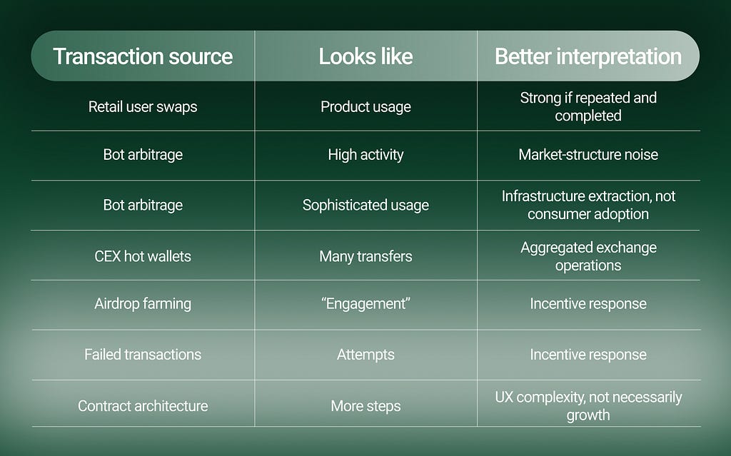
So a better metric is intent completion rate. That means asking:
Did the user complete the swap?
Did the route perform as expected?
Did they return?
Did they choose the same asset or ecosystem again?
Did failures cluster around a specific chain, token, liquidity source, or wallet type?
4. The Metric Most Likely to Look Impressive While Saying Very Little: Volume
Volume can be one of the dirtiest metrics in crypto. NFT markets gave the industry one of the clearest examples. Chainalysis has described NFT wash trading as transactions where the seller is effectively on both sides of the trade, creating a misleading picture of value and liquidity. In its 2022 crypto crime research, Chainalysis identified NFT wash trading as a significant abuse pattern and explained how self-funded address relationships can be used to detect suspicious trades.
Any market where the same actor can trade with themselves, recycle funds, or generate volume to qualify for rewards can produce misleading activity. Volume also needs to be separated by purpose.
There is a huge difference between:
- a user swapping ETH to USDC because they need stable liquidity;
- an arbitrage bot moving between pools;
- a market maker rebalancing inventory;
- a CEX moving funds internally;
- a farmer generating volume for a points campaign;
- a wash trader creating the appearance of demand.
All of these can show up as volume. Only some represent durable user demand.
So the more useful metric is quality-adjusted volume. That means discounting volume that appears circular, incentive-driven, bot-heavy, or operational rather than user-driven. It also means weighting volume by completion, repeat behavior, liquidity quality, and support cost.
Caption: Raw volume tells you that value moved. Quality-adjusted volume asks whether that movement came from durable user intent.
5. Growth or Just Disposable Identity? New Addresses
New addresses are often treated as the top of the adoption funnel. More new wallets means more new users, right? Not necessarily.
A new address can be a new person. It can also be:
- an existing user rotating wallets for privacy;
- a farmer creating hundreds of wallets;
- a bot deployment;
- a smart contract wallet;
- a CEX-generated address;
- a one-time bridge address;
- a wallet created only to claim, mint, test, or far
In crypto, identity is cheap. That is both a feature and an analytics nightmare. This is why “new addresses” should be treated as a cohort, not a conclusion.
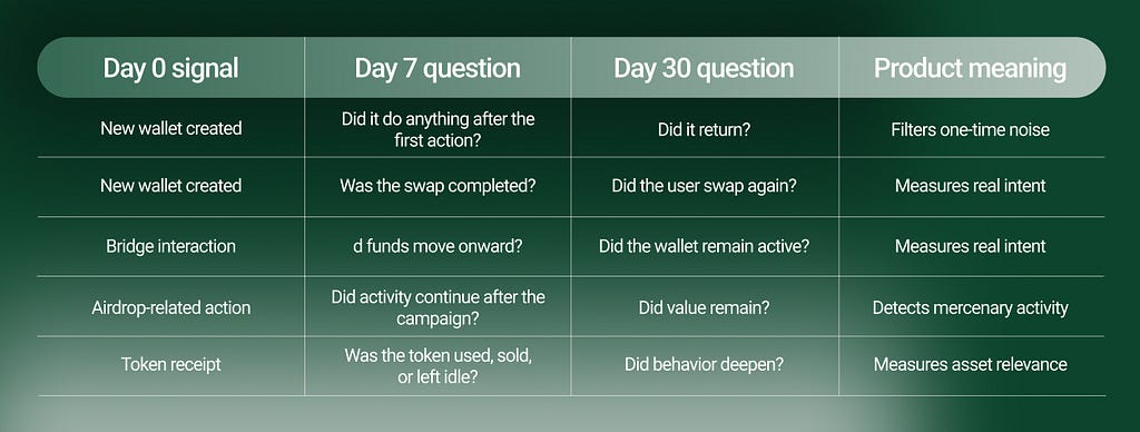
The Better Framework:
The issue is not that on-chain metrics are bad. The issue is that most people read them too literally.
A good product analytics framework should move through four layers.
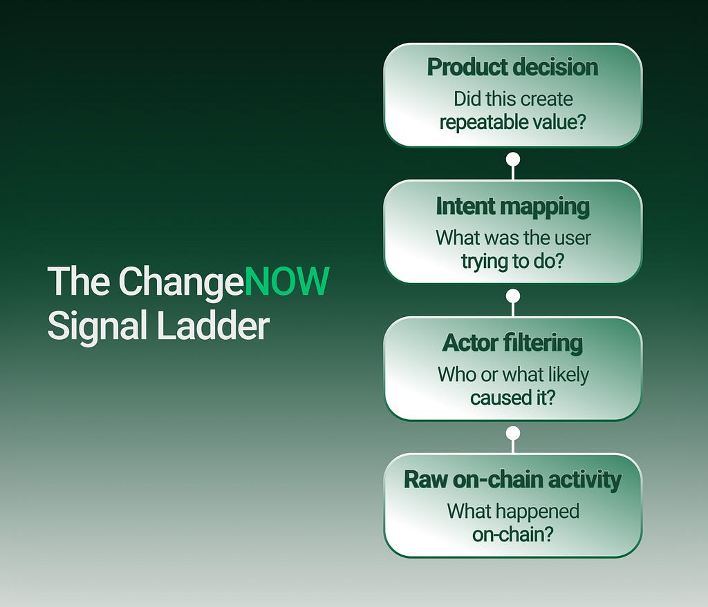
Caption: A metric becomes useful only when it moves from raw blockchain activity to a product decision: what to support, improve, prioritize, or ignore.
This is the core difference between market analytics and product analytics. Market analytics often asks: “What is trending?”. Product analytics asks: “What behavior should we build for?”
Inside ChangeNOW, on-chain analytics is most useful when it is connected to product reality. A public dashboard may show that a chain is heating up. That can tell us where to investigate. But before treating it as a product opportunity, we want to understand whether the signal survives contact with actual user behavior.
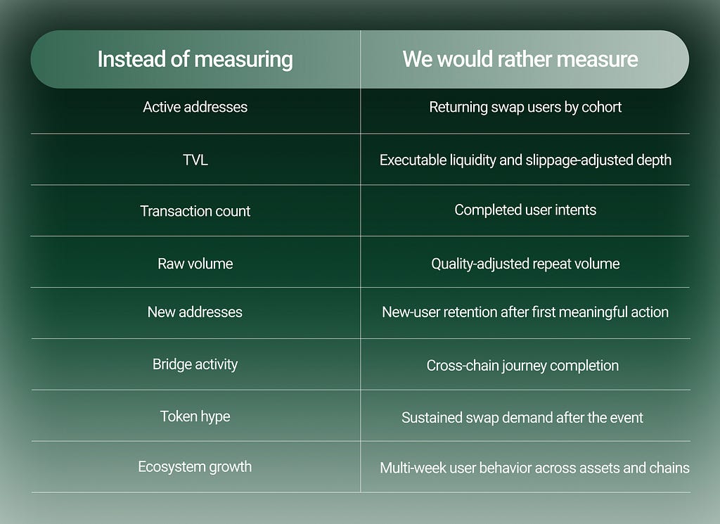
This kind of analysis is less flashy, but it is much closer to the truth.
Correlation Isn’t Causation: The 5 Most Misleading Metrics in On-Chain Analytics was originally published in The Capital on Medium, where people are continuing the conversation by highlighting and responding to this story.